Note: Uploading screenshots is taking time... I will upload soon
Learning Objectives:
• To understand the basics of Visual Basic Language
• To develop simple windows based application through visual studio
Learning outcomes
• Understanding of multi-language support in .Net
• Understanding of syntax of visual basic
• Familiarity with the environment of Visual Studio
Multi-Language Support:
As mentioned in previous lecture that the compiler of every language in .NET generates the same MSIL code. This also leads to language independence, as any compiled code is in the common format thus understandable by compilers of other languages (within) as well.
In addition it must be recalled that the assembly executed by CLR also contains MSIL which implies that CLR is not concerned or aware of the actual language in which code was written and treats the compiled code of all languages in the same way
Integrated Development Environment:
An Integrated Development Environment (IDE) brings all of the programmers tool’s into one convenient place. There was a time when programmers had to edit files, save the files out, run the compiler, then the linker, build the application then run it through a debugger.
Today's IDEs bring editor, compiler, linker and debugger into one place along with project management tools to increase programmer productivity.
Visual Studio
Visual Studio is an IDE for building ASP.NET Web applications, XML Web Services, desktop applications, and mobile applications. Visual Basic, Visual C++, Visual C#, and Visual J# all use the same integrated development environment (IDE), which allows them to share tools and facilitates in the creation of mixed-language solutions
For creating new projects navigate to the menu and on clicking the New Project option following screen will be displayed from which you will have to select the project type and language. The figure 2.1 shows selection of “windows application” using Visual Basic language. After choosing the appropriate template i.e. “Windows Application” give a name to the project which will be store by default in Documents if Express edition of visual studio is used.
Fig 2.1
Once you create the application a screen similar to the following will be created.
Fig 2.2
As can be observed that the IDE consists of a number of menus and windows. Let’s see the purpose of each window that can be seen on the screen. On the top left is the solution explorer. Figure 2.4 focuses on solution explorer only.
Fig 2.3
Solution Explorer allows you to view items and perform item management tasks in a solution or a project. It also allows you to use the Visual Studio editors to work on files outside the context of a solution or project. A single solution and its projects appear in a hierarchical display of solution explorer that provides updated information about the status of your solution, projects, and items. This allows you to work on several projects at the same time. Because the selected project and item determines the toolbar icons, this list is a partial representation of those you might encounter while working in Solution Explorer.
(Icon Image will come here)Displays the appropriate property user interface for the selected item in the tree view.
(Icon Image)Shows all project items, including those that have been excluded and those that are normally hidden.
(Icon Image)Refreshes the state of the items in the selected project or solution.
(Icon Image)Launches Class Designer to display a diagram of the classes in the current project. (Icon Image)Opens the selected file for editing in the Code Editor.
(Icon Image)Opens the selected file for editing in the designer mode of the Code Editor.
(Icon Image)Adds a Solution Folder to the selected item. You can add a Solution Folder to the solution or to an existing Solution Folder.
Apart from solution explores you can also see a properties window and a toolbox shown in the figure that are following.
Fig 2.4
Fig 2.5
The details of the above mentioned windows will be discussed later.
In figure 2.2 you must have observed the following at the center. This is the designer of form.
Fig 2.6
Before continuing the discussion lets first see what is a Windows Form.
Windows Forms: are the base unit of your windows application. It is actually a blank slate that you, as a developer, enhance with controls to create a user interface and with code to manipulate data. Controls are actually graphical user interface components through which end-users communicate with your application. Visual Studio displays the set of controls that can be used by the programmer in toolbox (displayed on figure 2.4).
Recall the definition of software frameworks that they consist of collection of items and plug-in points where users can insert instructions/code. The controls are basically the items that programmers can use to quickly develop graphical user interface and you can also associate code/instructions with each control. These instructions get executed when the end-user interact with the user-interface. For example, you may want a message box to be displayed to the user when the user clicks a button (control) on the form
Developing the First Application:
Let’s create a simple application consisting of a button which when clicked will display a message box consisting of message “Hello World”. The learning outcome of this will be that you will learn how to add controls to form, associate code with the control and execute the code. In addition the objective is to also let you know about the structure of instruction and the basics of the grammar of C# technically known as syntax.
To develop the application, open a new project. (Read the beginning of notes for lecture # 2). The designer (refer to Fig 2.6) will be displayed at the center, on the left solution explorer (Fig 2.3) and properties window (Fig 2.5) will be displayed. On the right side toolbar will be displayed (Fig. 2.4). Click “Button” on toolbar and then click on the form being displayed on the designer. This will cause a new button to be created. Congratulations you have created your first object belonging to the category/class Button. As discussed that each class/category has certain characteristics (data/methods) that all the objects possess. If you want to see the data associated with the newly created button object. Right-click the button and click properties from the menu displayed. Observe that the properties window will become activated. The properties window consist of data associated with the object and the values stored in each data field. If you want to modify the data you can simply change the value.
Lets change the “Text” displayed on the new button object. For that go to the text property in the property window and type “Click Me”. (You can enter any message of your choice).
In order to associate code with the button, double click the button and you will go into the code view. The code view allows you to write instructions or in other words do the programming for the form. Type the following line at the location where cursor is blinking.
After writing this line, go to the debug menu and click start debugging. This will cause your application to execute.
Adding More Controls:
Let’s add another control which is known as TextBox. Again follow the same procedure i.e. click TextBox on the toolbox and click on the form. This will create a text box. The textbox also consists of a property known as Text. Whatever is written in the text property will be displayed in textbox.
The next task is to display the contents of the TextBox in the MessageBox when the button is clicked. As mentioned that text property stores the contents of the textbox, therefore in order to get the contents of the textbox, we will write the following instruction
In order to display the contents in the message box we will modify the above code as follows.
The above line states that the contents of textBox1.Text should be given to MsgBox which, as we have already seen, will display whatever that has been passed in brackets.
Label Control:
Currently the form does not contain any indication about what should be entered in the textbox. For such a purpose, Label control is used and the process of adding it is same. As in other controls studied so far “Text” property here is also used for indicating what should be displayed in the Label
String constant:
When you observe the above codes regarding message box you will identify that when displaying a predetermined set of characters (also known as String) in the message box, we used double quotes (“”). However when we wanted the contents of textbox which obviously depends upon the input of the user, we didn’t use the double quotes. Actually when any thing is written outside double quote it is considered to be something that the compiler/runtime should evaluate however things that are written in double quotes are considered as string constants
Variables:
Variables are place holders that can hold data values. For example age can be stored in a variable for further processing. Similarly Text property of TextBox is also a variable as it stores string values that are typed in the textbox.
The process of creating a variable is known as declaration. Following is an example of declaring and integer variable. The example also includes statement to store a value in the declared variable which is known as assignment. When the variable is assigned a value first time, it is known as initialization.
The above statements can be combined into a single one which is indicated as follows
Variables are also created in classes but when created in classes they are known as properties. For example Microsoft created a variable named Text in class Label which is termed as property of label.
Data Type:
As mentioned that while creating a variable you must mention a data type of that variable. Languages provide data types so that space is effectively utilized and the operations that can be performed are easily identified. The importance of data types is easily understood when it is taken into consideration that in real life the data that is stored has various types, for example salary or price may consist of a decimal point however, age and population do not. In addition to this if you consider age and population age will store a maximum value of probably 150 however population can store an exponentially large value. Therefore it won’t be effective if a language provides a single data type for both age and population. In such case the data type should be large enough to hold population, however when the same data-type will be assigned to age a lot space will be unnecessarily wasted. Therefore Microsoft has provided a range of data types in visual basic.
Tuesday, January 4, 2011

Sunday, December 26, 2010
VB.NET Lecture # 1
Technology Trend: A brief review
Some time back companies acquired software to automate and speedup individual activities. For example a company bought an attendance system to improve timings, attendance and related activities. Similarly some companies bought “General Ledger” whereas others bought “Inventory Control Systems”.
Later people started to realize that greater benefits could be achieved if the data stored in one application is shared by others or if the applications integrated with each other. This lead to the introduction of Enterprise Software Solutions which consist of a number of modules supporting various activities of business. These modules are integrated with each other so that a holistic view of information is made available to stakeholders. These modules are often loosely coupled distributed applications that involve integration of components developed in different technologies.
The conclusion of the above discussion is that, these days it is important that the technology used by developers support integration of your product with others developed using heterogeneous platforms.
What is Microsoft .NET?
It is a set of software technologies for connecting information, people, systems, and devices. It enables a high level of software integration through the use of Web services that are small, discrete, building-block applications that connect to each other as well as to other, larger applications over the Internet.
What is a Framework?
It is a set of assumptions, concepts, values, and practices that constitutes a way of viewing reality. An example of framework is “The Primary Framework for literacy and mathematics” developed by the “Department of Children, Schools and Families, UK”. This framework has been designed to support teachers and schools to deliver high quality learning and teaching for all children. It contains detailed guidance and materials including concepts, values and practices to support literacy and mathematics in primary schools and settings.
Similarly in the local educational institutions you will find all teachers following certain guidelines and readymade documents. For example, similar attendance sheet is used by all and same marks distribution is followed. This is also an example of framework.
What are Software Frameworks? They support the development of software by providing collection of items which are reusable as a group. They have carefully designed plug–points into which the user inserts code to customize or extend the framework.
Horizontal Frameworks: Are generic and can be used to develop products for any business domain.
Vertical Frameworks: Are specialized and can be used to develop products for a specific domain.
What is .NET Framework? The .NET framework thus is a set of concepts, values, practices and items that can be used to develop next generation of applications. The .NET framework being a software framework has plug-In points defined that allow users to write code in order to develop customized applications. The .NET framework has two main components that are CLR (Common Language Runtime) and .NET Class Library. The details of these components will be discussed later in the text.
Objectives of the .NET framework:
The .NET framework is designed to achieve the following objectives,
• To provide a consisted programming environment whether a person is developing a window-based, web or other type of applications.
• To ensure that the code written in .NET can integrate with any other code. This has been done by making use of communication means that are industry standards rather than propriety ones
• To facilitate programmers by providing a consistent object oriented programming environment irrespective of whether the code is stored/executed locally, remotely or involves internet.
• To provide an environment that minimizes software deployment and versioning conflicts.
• Enable safe execution of code, including code created by unknown semi-trusted third party
• To improve performance that were there in previous scripted or interpreted environments
Components of .NET framework:
• Class Library: As mentioned that each framework has a collection of reusable items. The collection of reusable items, which is object oriented, is known as Class Library in Microsoft.NET
• Common Language Runtime: Like the runtime of any other language, CLR has the responsibility of executing the code of that language. However in .NET, CLR has additional responsibility of converting the code into native platform code. In other words, the responsibility of CLR is to translate code into platform understandable form, manage code at execution time, provide core services such as memory management, thread management, and remoting, while also enforcing strict type safety and other forms of code accuracy that promote security and robustness
Other important concepts:
Compiler: The responsibility of compiler in the environment of Microsoft.NET is to identify any syntactical errors in the code. If there are not any, then it converts the code into intermediate form
MSIL (Microsoft Intermediate Language): The compiled code in .NET takes the form of MSIL. Every language in .NET is converted into MSIL after compilation which is then converted into native form on execution by the CLR.
Assembly: The .exe or .dll file which is generated after compilation is referred to as Assembly. This assembly has two major ingredients, MSIL code and Metadata.
Metadata: Metadata means data about data. Metadata describes the types, members and references in code. This metadata is used by Runtime to locate and load classes. In addition it is also used for laying out instances in memory, to resolve method invocations, generate native code, enforce security and set run-time context boundaries
Some time back companies acquired software to automate and speedup individual activities. For example a company bought an attendance system to improve timings, attendance and related activities. Similarly some companies bought “General Ledger” whereas others bought “Inventory Control Systems”.
Later people started to realize that greater benefits could be achieved if the data stored in one application is shared by others or if the applications integrated with each other. This lead to the introduction of Enterprise Software Solutions which consist of a number of modules supporting various activities of business. These modules are integrated with each other so that a holistic view of information is made available to stakeholders. These modules are often loosely coupled distributed applications that involve integration of components developed in different technologies.
The conclusion of the above discussion is that, these days it is important that the technology used by developers support integration of your product with others developed using heterogeneous platforms.
What is Microsoft .NET?
It is a set of software technologies for connecting information, people, systems, and devices. It enables a high level of software integration through the use of Web services that are small, discrete, building-block applications that connect to each other as well as to other, larger applications over the Internet.
What is a Framework?
It is a set of assumptions, concepts, values, and practices that constitutes a way of viewing reality. An example of framework is “The Primary Framework for literacy and mathematics” developed by the “Department of Children, Schools and Families, UK”. This framework has been designed to support teachers and schools to deliver high quality learning and teaching for all children. It contains detailed guidance and materials including concepts, values and practices to support literacy and mathematics in primary schools and settings.
Similarly in the local educational institutions you will find all teachers following certain guidelines and readymade documents. For example, similar attendance sheet is used by all and same marks distribution is followed. This is also an example of framework.
What are Software Frameworks? They support the development of software by providing collection of items which are reusable as a group. They have carefully designed plug–points into which the user inserts code to customize or extend the framework.
Horizontal Frameworks: Are generic and can be used to develop products for any business domain.
Vertical Frameworks: Are specialized and can be used to develop products for a specific domain.
What is .NET Framework? The .NET framework thus is a set of concepts, values, practices and items that can be used to develop next generation of applications. The .NET framework being a software framework has plug-In points defined that allow users to write code in order to develop customized applications. The .NET framework has two main components that are CLR (Common Language Runtime) and .NET Class Library. The details of these components will be discussed later in the text.
Objectives of the .NET framework:
The .NET framework is designed to achieve the following objectives,
• To provide a consisted programming environment whether a person is developing a window-based, web or other type of applications.
• To ensure that the code written in .NET can integrate with any other code. This has been done by making use of communication means that are industry standards rather than propriety ones
• To facilitate programmers by providing a consistent object oriented programming environment irrespective of whether the code is stored/executed locally, remotely or involves internet.
• To provide an environment that minimizes software deployment and versioning conflicts.
• Enable safe execution of code, including code created by unknown semi-trusted third party
• To improve performance that were there in previous scripted or interpreted environments
Components of .NET framework:
• Class Library: As mentioned that each framework has a collection of reusable items. The collection of reusable items, which is object oriented, is known as Class Library in Microsoft.NET
• Common Language Runtime: Like the runtime of any other language, CLR has the responsibility of executing the code of that language. However in .NET, CLR has additional responsibility of converting the code into native platform code. In other words, the responsibility of CLR is to translate code into platform understandable form, manage code at execution time, provide core services such as memory management, thread management, and remoting, while also enforcing strict type safety and other forms of code accuracy that promote security and robustness
Other important concepts:
Compiler: The responsibility of compiler in the environment of Microsoft.NET is to identify any syntactical errors in the code. If there are not any, then it converts the code into intermediate form
MSIL (Microsoft Intermediate Language): The compiled code in .NET takes the form of MSIL. Every language in .NET is converted into MSIL after compilation which is then converted into native form on execution by the CLR.
Assembly: The .exe or .dll file which is generated after compilation is referred to as Assembly. This assembly has two major ingredients, MSIL code and Metadata.
Metadata: Metadata means data about data. Metadata describes the types, members and references in code. This metadata is used by Runtime to locate and load classes. In addition it is also used for laying out instances in memory, to resolve method invocations, generate native code, enforce security and set run-time context boundaries
Monday, December 13, 2010
Hard Disk Getting Filled In Windows 7
While working in office I noticed the Low Disk Space message on my Windows 7 machine. I calculated the total amount of memory consumed and it summed up to just 21 GB whereas the primary partition that was filled up had 30 GB of space.
Although the problem is not solved yet, but still I accumulated a lot of interesting bits of information.
First one is a tool named “TreeSize”.
TreeSize is a free tool that examines folders or hard drives to indicate the information consumed by items. It shows a lot of info that windows explorer does not show.
For example, through TreeSize I found that there is a file named “hiberfil.sys” which is consuming 1.5 GB of my Hard disk space and an MSOCache Folder which is consuming upto 2 GB of space.
Then I went on to search how to remove and get back the 1.5 GB space. Through this I determined that if hibernation is disabled then this file gets deleted automatically.
I found a very good article to do that and I am including its link below.
http://www.howtogeek.com/howto/15140/what-is-hiberfil.sys-and-how-do-i-delete-it/
Another folder that was eating a lot of space was MSOCache. On research it was discovered that this folder is related to MSOffice and is never recommended to delete it with windows explorer. The right way to clean this is to use Windows Cleanup Wizard
One last bit of information that was related to all this was using the "%temp%" command which should be typed in Run text box. This box is either displayed by clicking the start button or press Windows Button on Keyboard in combination with letter R . Novice users should just keep in mind that it displays a list of temporary files that you can delete without any fear or danger. In case, While deleting these files you encounter a warning that a particular file should not be deleted then you should not delete that file. Deleting these temporary will also make a lot of space available
The sad part of this story is that within 2 minutes of freeing up 1.5 GB my hard disk got filled again
Although the problem is not solved yet, but still I accumulated a lot of interesting bits of information.
First one is a tool named “TreeSize”.
TreeSize is a free tool that examines folders or hard drives to indicate the information consumed by items. It shows a lot of info that windows explorer does not show.
For example, through TreeSize I found that there is a file named “hiberfil.sys” which is consuming 1.5 GB of my Hard disk space and an MSOCache Folder which is consuming upto 2 GB of space.
Then I went on to search how to remove and get back the 1.5 GB space. Through this I determined that if hibernation is disabled then this file gets deleted automatically.
I found a very good article to do that and I am including its link below.
http://www.howtogeek.com/howto/15140/what-is-hiberfil.sys-and-how-do-i-delete-it/
Another folder that was eating a lot of space was MSOCache. On research it was discovered that this folder is related to MSOffice and is never recommended to delete it with windows explorer. The right way to clean this is to use Windows Cleanup Wizard
One last bit of information that was related to all this was using the "%temp%" command which should be typed in Run text box. This box is either displayed by clicking the start button or press Windows Button on Keyboard in combination with letter R . Novice users should just keep in mind that it displays a list of temporary files that you can delete without any fear or danger. In case, While deleting these files you encounter a warning that a particular file should not be deleted then you should not delete that file. Deleting these temporary will also make a lot of space available
The sad part of this story is that within 2 minutes of freeing up 1.5 GB my hard disk got filled again
Wednesday, November 24, 2010
Editing Installer (.MSI) through ORCA
Introduction:
This document attempts to provide a starting point to those who want to customize the MSI more than what is allowed through Visual Studio.
How to Obtain ORCA?
It’s installation is available when Windows SDK is installed. The installation is named ORCA.msi. After the successful completion of installation ORCA.exe will be available in Program Files
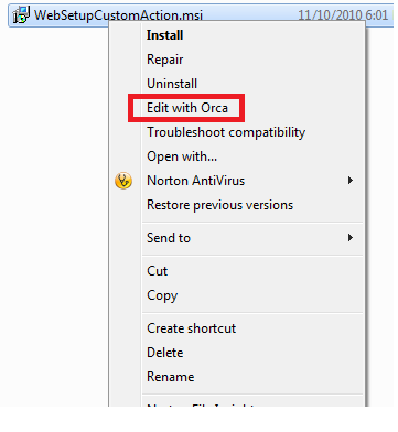
Editing installer in ORCA: After installation if you right click an installer, “Edit with ORCA” option will be available.
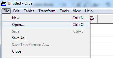
 Otherwise you can open ORCA and click File-Open to get the traditional FileOpen Dialog.
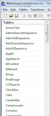
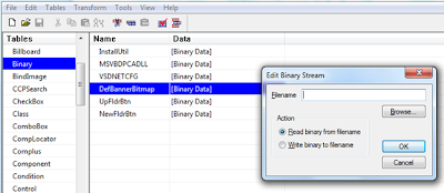
Once the file is opened a list of tables will be displayed. These tables contain various aspects of information that direct windows installer about how to execute the MSI file.
In case you want to modify the control types or labels you can select the “Control” element form the “Tables” list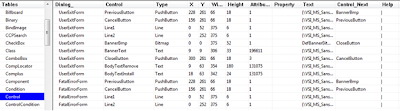 The values in the Type column in control table can be modified if required. For example, if it is desired to display something as ReadOnly, we can change the type from Edit to Text.
The Text property holds the font, followed by contents. The contents can be changed to desired values. It must also be noted that in some cases Text property holds a property rather than literal value e.g [TARGETAPPPOOL].
Another Table is “Binary” which holds things like banner image. We can double click any entry to change the file associated with it.
Important Points to Remember:
Please note that all changes that you make in installer will be overridden when you recompile the installer, for example through Visual Studio.
In addition, remember that orca can only modify MSI files not exe. The setup.exe generated while creating MSI through Visual Studio actually calls the corresponding MSI file. Therefore changes in MSI will effect Setup.exe automatically
This document attempts to provide a starting point to those who want to customize the MSI more than what is allowed through Visual Studio.
How to Obtain ORCA?
It’s installation is available when Windows SDK is installed. The installation is named ORCA.msi. After the successful completion of installation ORCA.exe will be available in Program Files
Editing installer in ORCA: After installation if you right click an installer, “Edit with ORCA” option will be available.
Otherwise you can open ORCA and click File-Open to get the traditional FileOpen Dialog.Once the file is opened a list of tables will be displayed. These tables contain various aspects of information that direct windows installer about how to execute the MSI file.
In case you want to modify the control types or labels you can select the “Control” element form the “Tables” list
The values in the Type column in control table can be modified if required. For example, if it is desired to display something as ReadOnly, we can change the type from Edit to Text.The Text property holds the font, followed by contents. The contents can be changed to desired values. It must also be noted that in some cases Text property holds a property rather than literal value e.g [TARGETAPPPOOL].
Another Table is “Binary” which holds things like banner image. We can double click any entry to change the file associated with it.
Important Points to Remember:
Please note that all changes that you make in installer will be overridden when you recompile the installer, for example through Visual Studio.
In addition, remember that orca can only modify MSI files not exe. The setup.exe generated while creating MSI through Visual Studio actually calls the corresponding MSI file. Therefore changes in MSI will effect Setup.exe automatically
Friday, November 19, 2010
Embedding SQL Server Installation and Restoring SQL Server Database Backup during Installation
As mentioned before, most recently i was involved in creation of installer for one of our products. One of the activity that was to be performed during installation was the restoration of database backup and invoking installer of SQL Server after checking registry. In this post i am including links of the articles that i found useful regarding restoration of databse and installation of SQL Server
How to restore a SQL Server database in .NET when there are connections open
(This is the simplest and most effective way that I could find regarding restoring backup file)
Read It
Restore Database during Application Deployment
Read It
Walkthrough: Using a Custom Action to Create a Database at Installation
Demonstrates the use of a custom action and the CustomActionData property to create a database and database table during installation.
Read It
Embedding SQL Server Express into Custom Applications
This white paper discusses how to integrate and deploy Microsoft SQL Server Express-based applications by using configuration files and the ClickOnce deployment technology in Microsoft Visual Studio.
(The good idea that I got from this was to create wrappers for installers that would perform tasks that are not doable through the Installer/Custom Action as it executes after the completion of installation process, not before it)
Read It
How to Embed SQL Server Express in an Application
If your application uses SQL Server Express to host its database, you can freely redistribute the SQL Server Express product with your application. This article contains information and links that will enable you to successfully embed SQL Server Express as part of your application installation.
Read It
How to restore a SQL Server database in .NET when there are connections open
(This is the simplest and most effective way that I could find regarding restoring backup file)
Read It
Restore Database during Application Deployment
Read It
Walkthrough: Using a Custom Action to Create a Database at Installation
Demonstrates the use of a custom action and the CustomActionData property to create a database and database table during installation.
Read It
Embedding SQL Server Express into Custom Applications
This white paper discusses how to integrate and deploy Microsoft SQL Server Express-based applications by using configuration files and the ClickOnce deployment technology in Microsoft Visual Studio.
(The good idea that I got from this was to create wrappers for installers that would perform tasks that are not doable through the Installer/Custom Action as it executes after the completion of installation process, not before it)
Read It
How to Embed SQL Server Express in an Application
If your application uses SQL Server Express to host its database, you can freely redistribute the SQL Server Express product with your application. This article contains information and links that will enable you to successfully embed SQL Server Express as part of your application installation.
Read It
Sunday, November 14, 2010
Introduction to ORCA: A Tool to Customize Windows Installers
These days I am involved in an activity of launching one of our products in market as ISV (Independent Software Vendor). One of the activities in that is to create an Installer for the product.
The installer that is created for Web Projects through Visual Studio 2010 is quite generalized and it was felt by us that we must tweak it to some extent to fit our actual requirements.
For example, the initial screens of installer ask the user to specify a virtual directory and an application pool. For specifying the virtual directory the installer presents a TextBox and for application pool a combo box is provided. However, in our case we wanted them to be “Non-Editable” fields so that the user is only informed about the virtual directory and application pool.
After research it was found that Windows SDK contains a tool called ORCA which allows us to modify the Installer file as per our requirements
ORCA presents the installer file as a database containing number of tables. For example, there is a table named “Control” which stores information about all the controls used in the installer.
The values in the table can be modified as per the requirement. One problem that I faced is that there is not enough documentation readily available which shows how to use ORCA (Or maybe it is, but I was not able to find it). Therefore I will dedicate a future post to using ORCA.
The installer that is created for Web Projects through Visual Studio 2010 is quite generalized and it was felt by us that we must tweak it to some extent to fit our actual requirements.
For example, the initial screens of installer ask the user to specify a virtual directory and an application pool. For specifying the virtual directory the installer presents a TextBox and for application pool a combo box is provided. However, in our case we wanted them to be “Non-Editable” fields so that the user is only informed about the virtual directory and application pool.
After research it was found that Windows SDK contains a tool called ORCA which allows us to modify the Installer file as per our requirements
ORCA presents the installer file as a database containing number of tables. For example, there is a table named “Control” which stores information about all the controls used in the installer.
The values in the table can be modified as per the requirement. One problem that I faced is that there is not enough documentation readily available which shows how to use ORCA (Or maybe it is, but I was not able to find it). Therefore I will dedicate a future post to using ORCA.
Wednesday, August 4, 2010
Customizing Silverlight Controls
Customizing Silverlight Controls
The best thing about Silverlight controls is that their appearance and behavior can be changed dramatically without affecting the functionality of the control.
For example a Button may display a simple text or it can display a grid on itself. The shape of a button can be left as default or it can be changed to a circle.
Introduction:
This document provides basic information that is very helpful in learning how the visual appearance of a Silverlight control can be changed. It is determines various ways of changing appearance and provide code samples.
Customizing Controls
Customization can be done by setting simple values in the properties or by storing a complex structures for example
<button name="SimpleBackground" type="submit" content="Hello" background="Yellow"></button>
<button name="ComplexBackground" type="submit" content="Hello">
<button.background>
<lineargradientbrush endpoint="1,1" startpoint="0,0">
<gradientstop color="Green" offset="0.2"></gradientstop>
<gradientstop color="Yellow" offset="1"></gradientstop>
</lineargradientbrush>
</button.background>
</button>
</pre>
In the above XAML, Button named “SimpleBackground” stores a simple color in Background where as “ComplexBackground” associates a complex structure.
Similarly the content of control can be set to a simple string or it can be set to a complex group of other controls. The example below instructs Silverlight to make a button that has a checkbox placed on it.
<button name="ComplexBackground" type="submit" row="0" column="1">
<button.background>
<lineargradientbrush endpoint="1,1" startpoint="0,0">
<gradientstop color="Green" offset="0.2"></gradientstop>
<gradientstop color="Yellow" offset="1"></gradientstop>
</lineargradientbrush>
</button.background>
<button.content>
<checkbox content="Click Me">
</button.content>
</button>
Following is the complete example which displays two buttons one of which is simple one displaying plain text and single color background, whereas the other has multi-color background and consists of a checbox .
<grid name="LayoutRoot" background="White" showgridlines="True">
<grid.columndefinitions>
<columndefinition width="*"></columndefinition>
<columndefinition width="4*"></columndefinition>
</grid.columndefinitions>
<grid.rowdefinitions>
<rowdefinition height="Auto"></rowdefinition>
</grid.rowdefinitions>
<button name="SimpleBackground" type="submit" content="Hello" background="Yellow" row="0" column="0"></button>
<button name="ComplexBackground" type="submit" row="0" column="1">
<button.background>
<lineargradientbrush endpoint="1,1" startpoint="0,0">
<gradientstop color="Green" offset="0.2"></gradientstop>
<gradientstop color="Yellow" offset="1"></gradientstop>
</lineargradientbrush>
</button.background>
<button.content>
<checkbox content="yo"></checkbox>
</button.content>
</button>
</grid>
Other Ways to Change Visual Appearance of Controls
The above code demonstrates how the visual appearance of a control can be changed using properties however in some cases you may want a single style to be applied to a number of controls. This can be done in two ways
• Using Styles
• Using ControlTemplate
Using Styles:
Styles are a collection of property values that can be applied to controls of particular type. The style can be stored in a separate file for global usage. The “TargetType” property of a style specifies the controls to which the style can be applied to. It is also possible to specify a key for the style, in which case the style will only be applied to controls which refer to that key.
Following code demonstrates how a style can be created
<pre>
<usercontrol.resources>
<style targettype="Button">
<setter property="Background">
<setter.value>
<lineargradientbrush startpoint="0,0" endpoint="1,1">
<gradientstop offset="0.2" color="Green"></gradientstop>
<gradientstop offset="1" color="Yellow"></gradientstop>
</lineargradientbrush>
</Setter.Value>
</setter>
<setter property="FontFamily" value="Arial Black"></setter>
<setter property="MaxWidth" value="100"></setter>
<setter property="MaxHeight" value="50"></setter>
</style>
</usercontrol.resources>
<pre>
Once the above style is created, all controls belonging to the type mentioned in the TargetType property will have the same property values as indicated in the style. For example, the following code creates two buttons. Although not mentioned explicitly but these buttons will have the style created above as both of them belong to the type button.
<button type="submit" content="Button1" row="1" column="1">
<button type="submit" content="Button2" row="1" column="2">
Using Control Template
Control Templates are used in case where we want to completely customize the look and feel as well as behavior of controls. E.g. of complete customization includes replacing or removing parts of a control or adding new parts. For simply setting the properties to certain values, Style is simplest and best choice.
ControlTemplate combine FrameworkElement objects to build a single control. A controlTemplate must have a single FrameworkElement at its root.
The Template property of a control is used to specify the ControlTemplate for that control. Template property can be set in the following three ways
• Set the Template property to an Inline template
<pre>
</pre><button type="submit" content="Button1">
<button.template>
<controltemplate targettype="Button">
<!--Define the ControlTemplate here.-->
</controltemplate>
</button.template>
</button>
<pre></pre>
• Set the Template property to reference ControlTemplate defined as a resource
<pre>
<grid>
<grid.resources>
<controltemplate targettype="Button" key="newTemplate">
<!--Define the ControlTemplate here.-->
</controltemplate>
</grid.resources>
<button type="submit" template="{StaticResource newTemplate}" content="Button1">
</grid>
<pre></pre>
• Define Template in a Style and link control to that style
<pre>
<stackpanel>
<stackpanel.resources>
<style targettype="Button" key="newTemplate">
<setter property="Template">
<setter.value>
<controltemplate targettype="Button">
<!--Define the ControlTemplate here.-->
</controltemplate>
</Setter.Value>
</setter>
</style>
</stackpanel.resources>
</pre><button type="submit" content="Button1">
</stackpanel>
<pre></pre>
Following is an example that sets the template for a control by combining a number of framework elements
<pre>
<usercontrol.resources>
<style targettype="Button">
<setter property="Template">
<setter.value>
<controltemplate>
<grid>
<rectangle width="200" height="100" fill="Blue" stroke="Black" strokethickness="7">
<ellipse width="100" height="100" fill="Transparent" stroke="Yellow" strokethickness="5"></ellipse>
<textblock text="Click Me" horizontalalignment="Center" verticalalignment="Center" foreground="White"></textblock>
</grid>
</controltemplate>
</Setter.Value>
</setter>
</style>
</usercontrol.resources>
</pre>
Binding Template to Control Properties using TemplateBinding
One more requirement can arise, that the user of control may want the Template to get some values from the control. For example, we want the color of Rectangle within a template to be that which has been assigned to the background property of Button to which the template is being applied.
The TemplateBinding Markup Extension serves this purpose. It enables the template to change itself based upon the public properties of control. The following code indicates that the value of Fill property will be set by the value of Background property of control
<pre>
<rectangle width="200" height="100" strokethickness="7" stroke="Black" fill="{TemplateBinding Background}">
</pre>
It must also be noted that the Control class defines several properties that can be used by ControlTemplate to have an effect on the control when they are set.
Using ContentPresenter:
One more flexibility is that we can include ContentPresenter in the template rather than controls like TextBlock or Button. This enables the user of control to set a group of controls in the content rather than just text.
Following is the complete example demonstrates the usage of ContentPresenter
<pre>
<usercontrol.resources>
<style targettype="Button">
<setter property="Template">
<setter.value>
<controltemplate>
<grid>
<rectangle width="200" height="100" fill="{TemplateBinding Background}" stroke="Black" strokethickness="7">
<ellipse width="100" height="100" fill="Transparent" stroke="Yellow" strokethickness="5"></ellipse>
<contentpresenter content="{TemplateBinding Content}" horizontalalignment="Center" verticalalignment="Center"></contentpresenter>
</grid>
</controltemplate>
</Setter.Value>
</setter>
</style>
</usercontrol.resources>
<grid name="LayoutRoot" background="White">
</pre><button type="submit" content="Hello" background="Aqua">
</button>
</grid>
</pre>
Customizing Controls by Understanding the Control Contract
Controls that uses ControlTemplate to specify visual structure use Parts Control Model. Many controls that are offered by Microsoft and third-parties follow this model. As per this model, it can be said that a control is made up of “Parts”. The information about these parts of a control is communicated through the control contract. Understanding control contract is very helpful in customizing the appearance of control based on a template
Contract has three elements
• Visual Elements
o These are used by the logic inside a control. In other words the code of control has references to certain FrameworkElements. Therefore the template must have objects for these references. The control uses the TemplatePartAttribute to convey the type of element that is expected, and what the name of the element should be.
• States
o The states of a control are also a part of the control contract. The states of a control are specified by the TemplateVisualStateAttribute
• Public properties
o Public properties are also considered as a part of contract. The properties can also be set without creating any ControlTemplate
Conclusion:
Appearance of Silverlight controls can be changed by
• Directly setting properties
• Creating Styles
• Creating Templates
Understanding control contract is very helpful in creating templates for a control. The class of control communicates the control contract by using TemplatePartAttribute and TemplateVisualStateAttribute
The best thing about Silverlight controls is that their appearance and behavior can be changed dramatically without affecting the functionality of the control.
For example a Button may display a simple text or it can display a grid on itself. The shape of a button can be left as default or it can be changed to a circle.
Introduction:
This document provides basic information that is very helpful in learning how the visual appearance of a Silverlight control can be changed. It is determines various ways of changing appearance and provide code samples.
Customizing Controls
Customization can be done by setting simple values in the properties or by storing a complex structures for example
<button name="SimpleBackground" type="submit" content="Hello" background="Yellow"></button>
<button name="ComplexBackground" type="submit" content="Hello">
<button.background>
<lineargradientbrush endpoint="1,1" startpoint="0,0">
<gradientstop color="Green" offset="0.2"></gradientstop>
<gradientstop color="Yellow" offset="1"></gradientstop>
</lineargradientbrush>
</button.background>
</button>
</pre>
In the above XAML, Button named “SimpleBackground” stores a simple color in Background where as “ComplexBackground” associates a complex structure.
Similarly the content of control can be set to a simple string or it can be set to a complex group of other controls. The example below instructs Silverlight to make a button that has a checkbox placed on it.
<button name="ComplexBackground" type="submit" row="0" column="1">
<button.background>
<lineargradientbrush endpoint="1,1" startpoint="0,0">
<gradientstop color="Green" offset="0.2"></gradientstop>
<gradientstop color="Yellow" offset="1"></gradientstop>
</lineargradientbrush>
</button.background>
<button.content>
<checkbox content="Click Me">
</button.content>
</button>
Following is the complete example which displays two buttons one of which is simple one displaying plain text and single color background, whereas the other has multi-color background and consists of a checbox .
<grid name="LayoutRoot" background="White" showgridlines="True">
<grid.columndefinitions>
<columndefinition width="*"></columndefinition>
<columndefinition width="4*"></columndefinition>
</grid.columndefinitions>
<grid.rowdefinitions>
<rowdefinition height="Auto"></rowdefinition>
</grid.rowdefinitions>
<button name="SimpleBackground" type="submit" content="Hello" background="Yellow" row="0" column="0"></button>
<button name="ComplexBackground" type="submit" row="0" column="1">
<button.background>
<lineargradientbrush endpoint="1,1" startpoint="0,0">
<gradientstop color="Green" offset="0.2"></gradientstop>
<gradientstop color="Yellow" offset="1"></gradientstop>
</lineargradientbrush>
</button.background>
<button.content>
<checkbox content="yo"></checkbox>
</button.content>
</button>
</grid>
Other Ways to Change Visual Appearance of Controls
The above code demonstrates how the visual appearance of a control can be changed using properties however in some cases you may want a single style to be applied to a number of controls. This can be done in two ways
• Using Styles
• Using ControlTemplate
Using Styles:
Styles are a collection of property values that can be applied to controls of particular type. The style can be stored in a separate file for global usage. The “TargetType” property of a style specifies the controls to which the style can be applied to. It is also possible to specify a key for the style, in which case the style will only be applied to controls which refer to that key.
Following code demonstrates how a style can be created
<pre>
<usercontrol.resources>
<style targettype="Button">
<setter property="Background">
<setter.value>
<lineargradientbrush startpoint="0,0" endpoint="1,1">
<gradientstop offset="0.2" color="Green"></gradientstop>
<gradientstop offset="1" color="Yellow"></gradientstop>
</lineargradientbrush>
</Setter.Value>
</setter>
<setter property="FontFamily" value="Arial Black"></setter>
<setter property="MaxWidth" value="100"></setter>
<setter property="MaxHeight" value="50"></setter>
</style>
</usercontrol.resources>
<pre>
Once the above style is created, all controls belonging to the type mentioned in the TargetType property will have the same property values as indicated in the style. For example, the following code creates two buttons. Although not mentioned explicitly but these buttons will have the style created above as both of them belong to the type button.
<button type="submit" content="Button1" row="1" column="1">
<button type="submit" content="Button2" row="1" column="2">
Using Control Template
Control Templates are used in case where we want to completely customize the look and feel as well as behavior of controls. E.g. of complete customization includes replacing or removing parts of a control or adding new parts. For simply setting the properties to certain values, Style is simplest and best choice.
ControlTemplate combine FrameworkElement objects to build a single control. A controlTemplate must have a single FrameworkElement at its root.
The Template property of a control is used to specify the ControlTemplate for that control. Template property can be set in the following three ways
• Set the Template property to an Inline template
<pre>
</pre><button type="submit" content="Button1">
<button.template>
<controltemplate targettype="Button">
<!--Define the ControlTemplate here.-->
</controltemplate>
</button.template>
</button>
<pre></pre>
• Set the Template property to reference ControlTemplate defined as a resource
<pre>
<grid>
<grid.resources>
<controltemplate targettype="Button" key="newTemplate">
<!--Define the ControlTemplate here.-->
</controltemplate>
</grid.resources>
<button type="submit" template="{StaticResource newTemplate}" content="Button1">
</grid>
<pre></pre>
• Define Template in a Style and link control to that style
<pre>
<stackpanel>
<stackpanel.resources>
<style targettype="Button" key="newTemplate">
<setter property="Template">
<setter.value>
<controltemplate targettype="Button">
<!--Define the ControlTemplate here.-->
</controltemplate>
</Setter.Value>
</setter>
</style>
</stackpanel.resources>
</pre><button type="submit" content="Button1">
</stackpanel>
<pre></pre>
Following is an example that sets the template for a control by combining a number of framework elements
<pre>
<usercontrol.resources>
<style targettype="Button">
<setter property="Template">
<setter.value>
<controltemplate>
<grid>
<rectangle width="200" height="100" fill="Blue" stroke="Black" strokethickness="7">
<ellipse width="100" height="100" fill="Transparent" stroke="Yellow" strokethickness="5"></ellipse>
<textblock text="Click Me" horizontalalignment="Center" verticalalignment="Center" foreground="White"></textblock>
</grid>
</controltemplate>
</Setter.Value>
</setter>
</style>
</usercontrol.resources>
</pre>
Binding Template to Control Properties using TemplateBinding
One more requirement can arise, that the user of control may want the Template to get some values from the control. For example, we want the color of Rectangle within a template to be that which has been assigned to the background property of Button to which the template is being applied.
The TemplateBinding Markup Extension serves this purpose. It enables the template to change itself based upon the public properties of control. The following code indicates that the value of Fill property will be set by the value of Background property of control
<pre>
<rectangle width="200" height="100" strokethickness="7" stroke="Black" fill="{TemplateBinding Background}">
</pre>
It must also be noted that the Control class defines several properties that can be used by ControlTemplate to have an effect on the control when they are set.
Using ContentPresenter:
One more flexibility is that we can include ContentPresenter in the template rather than controls like TextBlock or Button. This enables the user of control to set a group of controls in the content rather than just text.
Following is the complete example demonstrates the usage of ContentPresenter
<pre>
<usercontrol.resources>
<style targettype="Button">
<setter property="Template">
<setter.value>
<controltemplate>
<grid>
<rectangle width="200" height="100" fill="{TemplateBinding Background}" stroke="Black" strokethickness="7">
<ellipse width="100" height="100" fill="Transparent" stroke="Yellow" strokethickness="5"></ellipse>
<contentpresenter content="{TemplateBinding Content}" horizontalalignment="Center" verticalalignment="Center"></contentpresenter>
</grid>
</controltemplate>
</Setter.Value>
</setter>
</style>
</usercontrol.resources>
<grid name="LayoutRoot" background="White">
</pre><button type="submit" content="Hello" background="Aqua">
</button>
</grid>
</pre>
Customizing Controls by Understanding the Control Contract
Controls that uses ControlTemplate to specify visual structure use Parts Control Model. Many controls that are offered by Microsoft and third-parties follow this model. As per this model, it can be said that a control is made up of “Parts”. The information about these parts of a control is communicated through the control contract. Understanding control contract is very helpful in customizing the appearance of control based on a template
Contract has three elements
• Visual Elements
o These are used by the logic inside a control. In other words the code of control has references to certain FrameworkElements. Therefore the template must have objects for these references. The control uses the TemplatePartAttribute to convey the type of element that is expected, and what the name of the element should be.
• States
o The states of a control are also a part of the control contract. The states of a control are specified by the TemplateVisualStateAttribute
• Public properties
o Public properties are also considered as a part of contract. The properties can also be set without creating any ControlTemplate
Conclusion:
Appearance of Silverlight controls can be changed by
• Directly setting properties
• Creating Styles
• Creating Templates
Understanding control contract is very helpful in creating templates for a control. The class of control communicates the control contract by using TemplatePartAttribute and TemplateVisualStateAttribute
Subscribe to:
Posts (Atom)